Colors
Headings
All HTML headings, <h1> through <h6>, are available.
Heading 2 example
Heading 3 example
Heading 4 example
Heading 5 example
Heading 6 example
List Types
Ordered List
An unordered list starts with the <ol> tag. Each list item starts with the <li> tag. The list items will be marked with numbers by default:
- List Item 1
- List Item 2
- Nested list item A
- Nested list item B
- List Item 3
Unordered List
An unordered list starts with the <ul> tag. Each list item starts with the <li> tag. The list items will be marked with bullets by default:
- List Item a
- List Item b
- Nested list item 1
- Nested list item 2
- Double Nested item 1
- Double Nested item 2
- List Item 3
Blockquotes
For quoting blocks of content from another source within your document.
Single line blockquote:
Stay hungry. Stay foolish.
Multi line blockquote:
People think focus means saying yes to the thing you’ve got to focus on. But that’s not what it means at all. It means saying no to the hundred other good ideas that there are. You have to pick carefully. I’m actually as proud of the things we haven’t done as the things I have done. Innovation is saying no to 1,000 things. - Biron Themes
Alternative blockquote style:
Success is not final, failure is not fatal: it is the courage to continue that counts.
Buttons
Colors
<button class="btn mb">Default</button>
<button class="btn btn--brand mb">Brand</button>
<button class="btn btn--success mb">Success</button>
<button class="btn btn--error mb">Error</button>
<button class="btn btn--warning mb">Warning</button>
<button class="btn btn--bordered mb">Bordered</button>
<button class="btn btn--bordered btn--brand mb">Bordered Brand</button>
<button class="btn btn--brand is-loading mb">Loading</button>
Sizes
<button class="btn btn--sm mb">Small Button</button>
<button class="btn mb">Default Button</button>
<button class="btn btn--lg mb">Large Button</button>
<button class="btn btn--xl mb">Huge Button</button>
<button class="btn btn--full mb">Full Width Button</button>
Bookmark cards
 Bright Themes
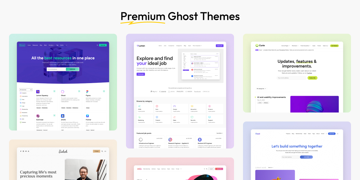
Bright Themes

Ghost CMS
Callout cards
Toggle cards
Want some collapsible content?
You can use toggle cards to add collapsible content, which for example can be used for an FAQ section
Where to find the best Ghost Themes?
Check out our collection of Premium Ghost Themes.
Video cards
Share your videos
Audio cards
File cards
Product cards
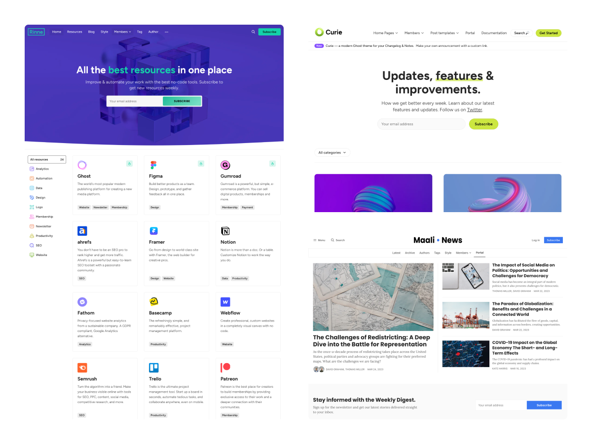
Premium Ghost Themes
Check out the best Ghost Themes for your blog, newsletter, or portfolio.
Header cards
Simple header card
Regular width and no button
Wide header card
Full-width header card
Split header card
Signup cards

Images


Image Gallery
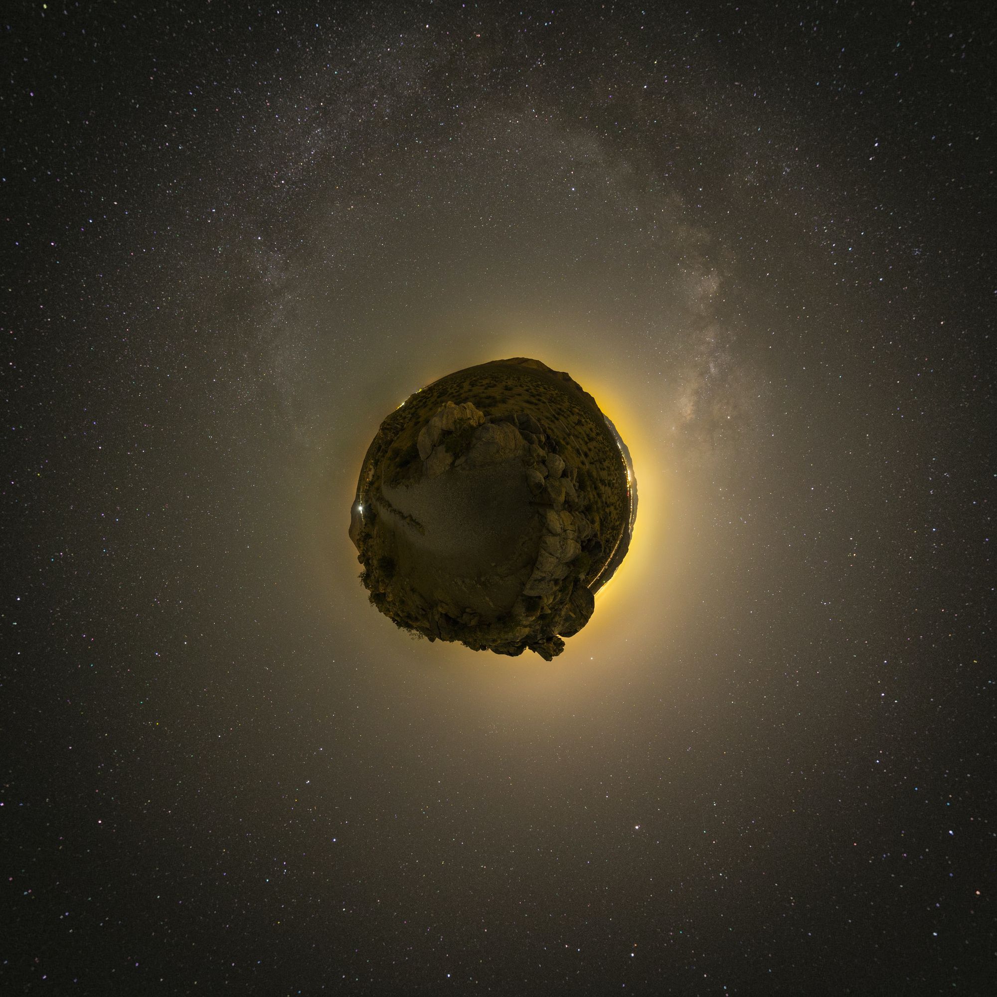
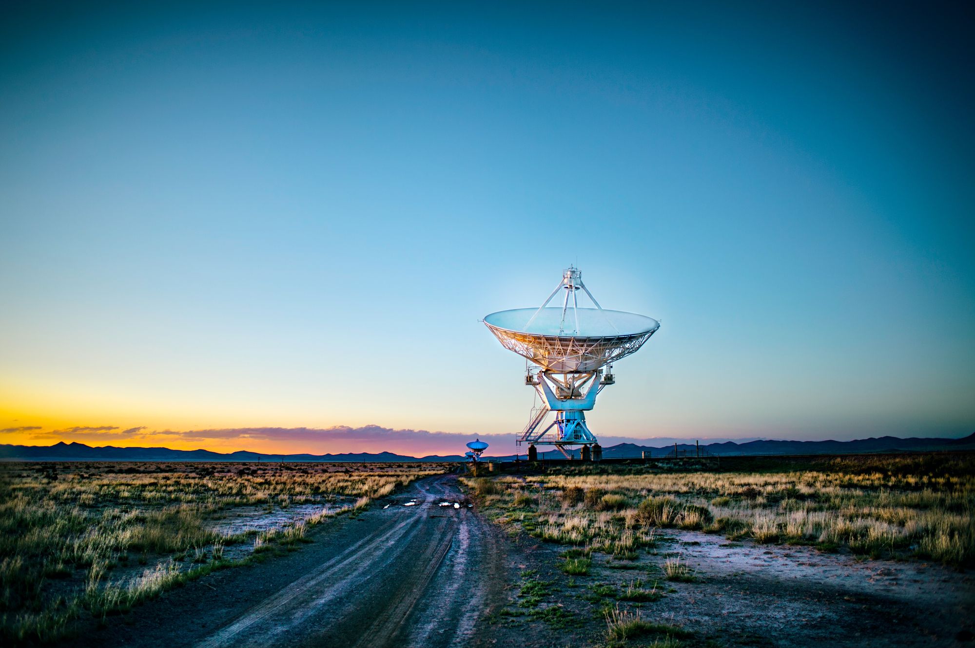
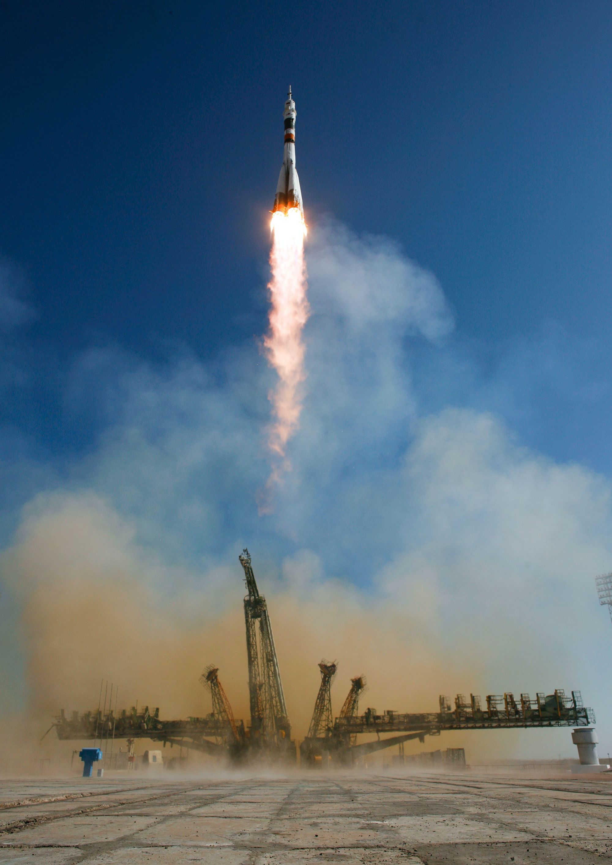
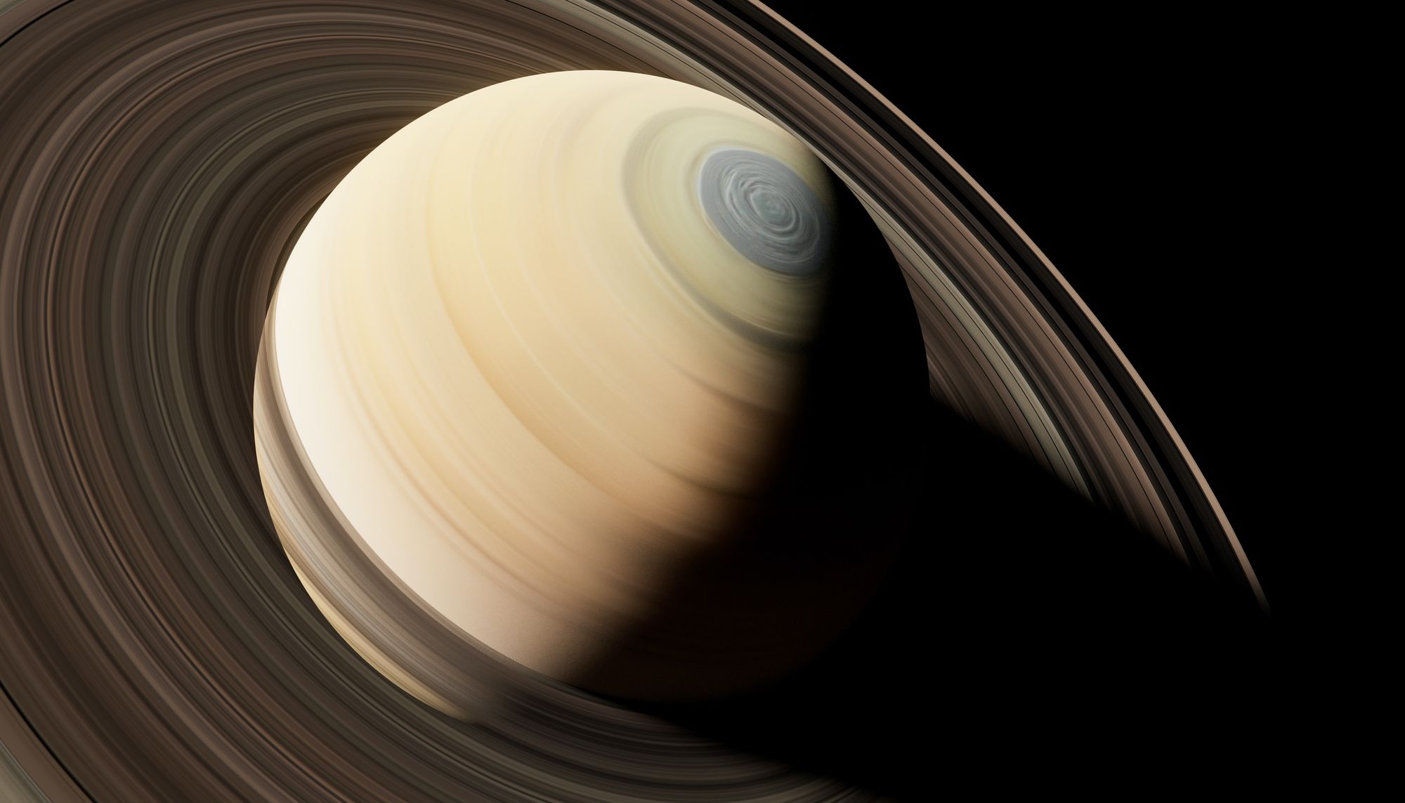

Image gallery
Embeds
Youtube
Vimeo
✨6 years ago we launched the first version of Ghost
— Ghost (@Ghost) October 22, 2019
Today, we're launching Ghost 3.0 — A new business model for independent publishing 📰, a new JAMstack architecture 🛠, and so much more 🤗
Oh, also, we raised $5,000,000 👉 https://t.co/TqyINBJVV3
https://www.instagram.com/p/B_U_Dv7n-X8/
Codepen
Spotify
Soundcloud
Text-level semantics
Styling for common inline HTML5 elements.
The a element example.
The abbr element and abbr element with title examples
The b element example
The cite element example
The code element example
The del element example
The dfn element and dfn element with title examples
The em element example
The i element example
The ins element example
The kbd element example
The mark element example
The q element inside a q element example
The s element example
The samp element example
The small element example
The span element example
The strong element example
The sub element example
The sup element example
The var element example
The u element example
The <details> element:
Details Summary
Details content. Lorem ipsum dolor sit amet, consectetur adipiscing elit, sed do eiusmod tempor incididunt ut labore et dolore magna aliqua. Ut enim ad minim veniam, quis nostrud exercitation ullamco laboris nisi ut aliquip ex ea commodo consequat. Duis aute irure dolor in reprehenderit in voluptate velit esse cillum dolore eu fugiat nulla pariatur. Excepteur sint occaecat cupidatat non proident, sunt in culpa qui officia deserunt mollit anim id est laborum.
Notifications
Tables
| # | Table_Header_1 | Table_Header_2 | Table_Header_3 | Table_Header_4 | Table_Header_5 | Table_Header_6 | Table_Header_7 | Table_Header_8 |
|---|---|---|---|---|---|---|---|---|
| 1 | Division 1 | Division 2 | Division 3 | Division 4 | Division 5 | Division 6 | Division 7 | Division 8 |
| 2 | Division 1 | Division 2 | Division 3 | Division 4 | Division 5 | Division 6 | Division 7 | Division 8 |
| 3 | Division 1 | Division 2 | Division 3 | Division 4 | Division 5 | Division 6 | Division 7 | Division 8 |
| # | Table_Header_1 | Table_Header_2 | Table_Header_3 |
|---|---|---|---|
| 1 | Division 1 | Division 2 | Division 3 |
| 2 | Division 1 | Division 2 | Division 3 |
| 3 | Division 1 | Division 2 | Division 3 |